Improve accessibility and mobile experience | AWS
Accessibility in data visualization
The goal of using data visualizations is making data easier to comprehend and consume. For colour blind, low vision users, users with motor impairments or cognitive challenges can be difficult to comprehend the data correctly.
6 important guidelines I used in Dashboards services to make data visualization more accessible:
- Provide an alternate format – like a text summary or a simple table format.
- Ensure sufficient contrast – use W3C WCAG 2.1 guidelines.
- No rely on colours to convey information – use tooltips and hotspots.
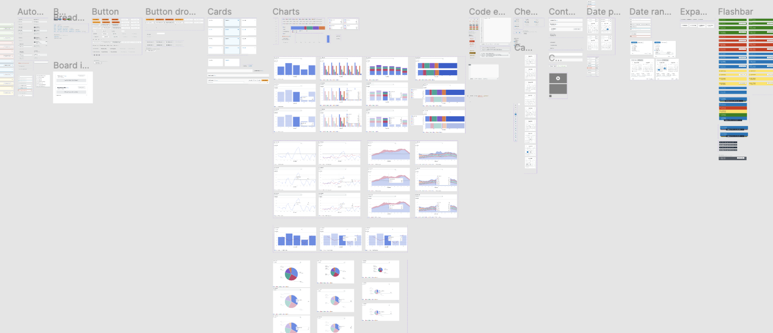
- Prefer simple, familiar visualizations over complex viz.
- Allow users to turn off motions and animations.
- Make interactive visualizations keyboard accessible.
- Ensure the visualization is responsive to different screen sizes and zoom levels
Design a responsive design system
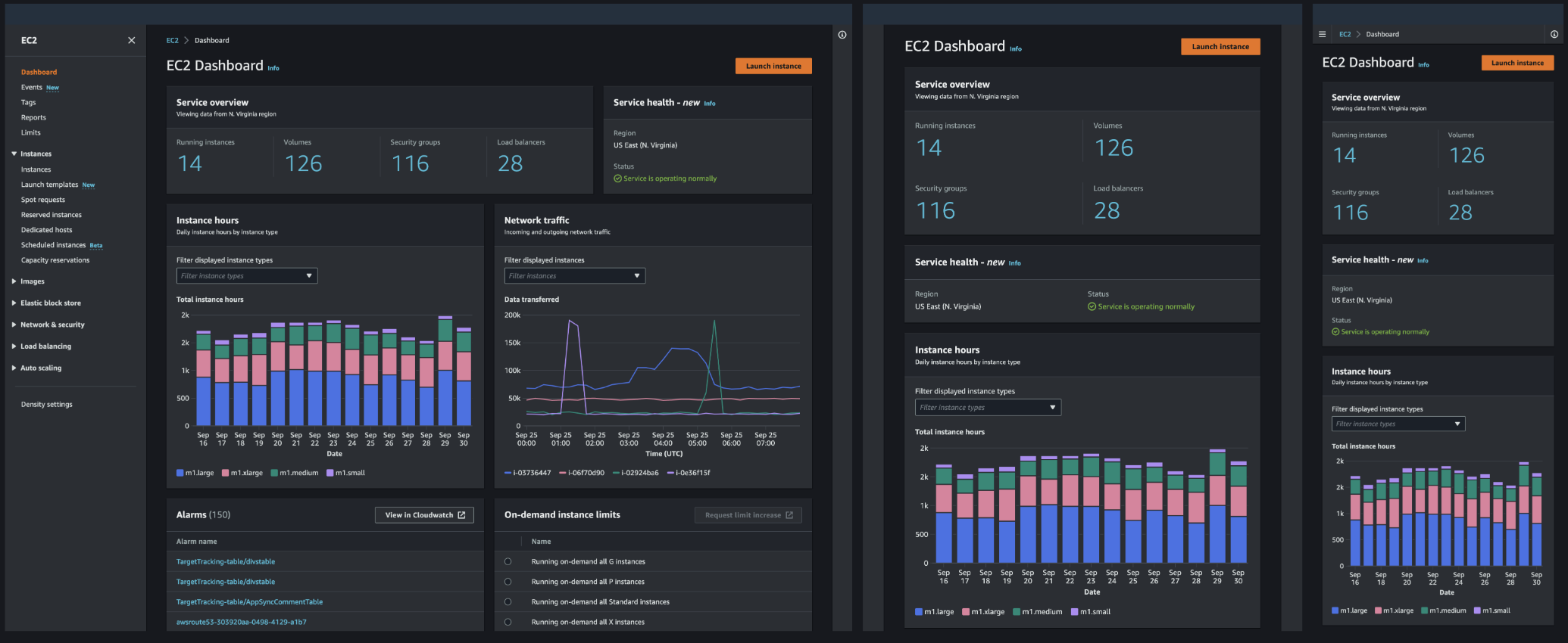
Along with the proliferation of mobile devices is an increasing variety of screen sizes. Mobile phone screen size can be larger than a small tablet, and computer monitors rival the size of TVs. The device itself is no longer a clear indication of the size of the display, which is why device size can’t be the sole criteria used when designing interfaces.
My advice is: “Don’t build your designs for specific screen sizes, devices, or resolutions; instead, build for responsive, fluid content in a browser.”
Furthermore, the size of the viewport cannot be the only criterion to take into account when designing a layout for a specific part of the interface: the available real estate depends also on the state of the application. For example, the available space for the content of a page depends on whether the navigation or tools drawers of the application layout are open or closed. The design system I built allows to adapt the layout of the content to the available space, rather than to the size of the viewport.
Design content first, and use the grid and column layout components to build a responsive layout that resizes and adapts dynamically according to the space that is available for your content. I provided a set of six predefined breakpoints to optimize the interface. They do not refer to the width of the viewport, but to the width of the specific container that I’m designing.
Breakpoint mapping: [‘xl‘, 1840], [‘l‘, 1320], [‘m‘, 1120], [‘s‘, 912], [‘xs‘, 688], [‘xxs‘, 465]
Fluid design
Responsive assessment
When I tested the content based on the browser window sizes, I considered the following:
- Does the content look good on all sizes?
- Are there some sizes where the content wraps in an unexpected way? If so, I considered adjusting the content to the breakpoint.
- Are lines longer than the maximum readable length (70-80 characters per line)? If so, I considered changing the layout.
- Is there too much white space between elements? If so, I considered adding a maximum width.
General guidelines I shared with the design team
- Dive deep into the use cases and concept of your interface before you build wireframes.
- Consider the user context or scenario for using your service (for example: in a hurry, small browser windows to large displays) and prioritize your design decisions accordingly (for example: mobile first).
- Don’t reduce functionality or remove content for smaller viewports. Users should be able to access the same content regardless of the browser window they are using.
- Incorporate responsive design early in your design process. Design a uniform and seamless user experience across breakpoints, and don’t design for specific devices or screen sizes.
- Don’t rely on a fixed position of elements in your layouts. The more fluid your design is, the better the responsiveness of your interface.