Improve navigation and discoverability | AWS
 Goal
Goal
My goal is to improve the experience by making CloudWatch a more seamless product and helping users find “their stuff” faster.
I believe that this improvement will also boost retention in our platform.
In order to meet the goal I will need to improve the primary navigation, the information architecture of the home page and introduce some new UI/patterns to support navigation and discoverability.
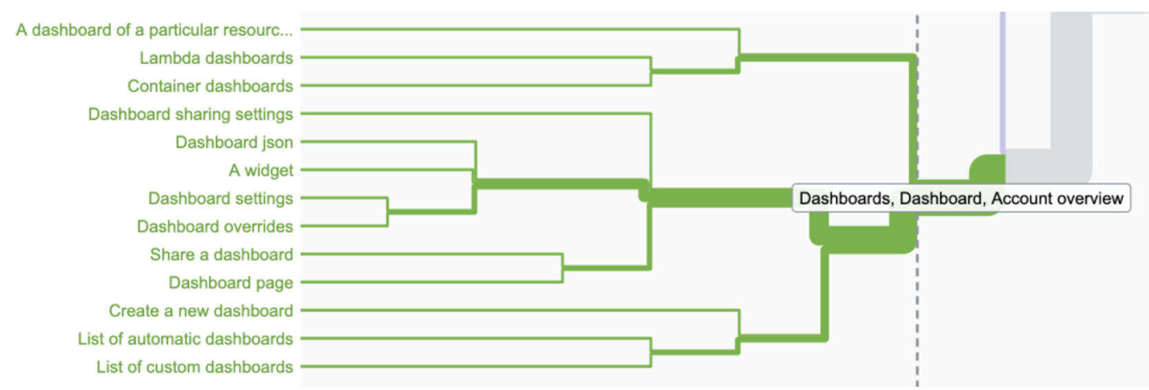
Research #Card sorting
What did I do
- Mix of contextual interviews and card sorting exercises.
How did I do it?
- 52 cards were sorted by a mix of internal users (4), external users (4 from BBC, Netflix and JustEat), and stakeholders (9, mostly PMs).
What did I get?
- Qualitative finding about navigation pain points.
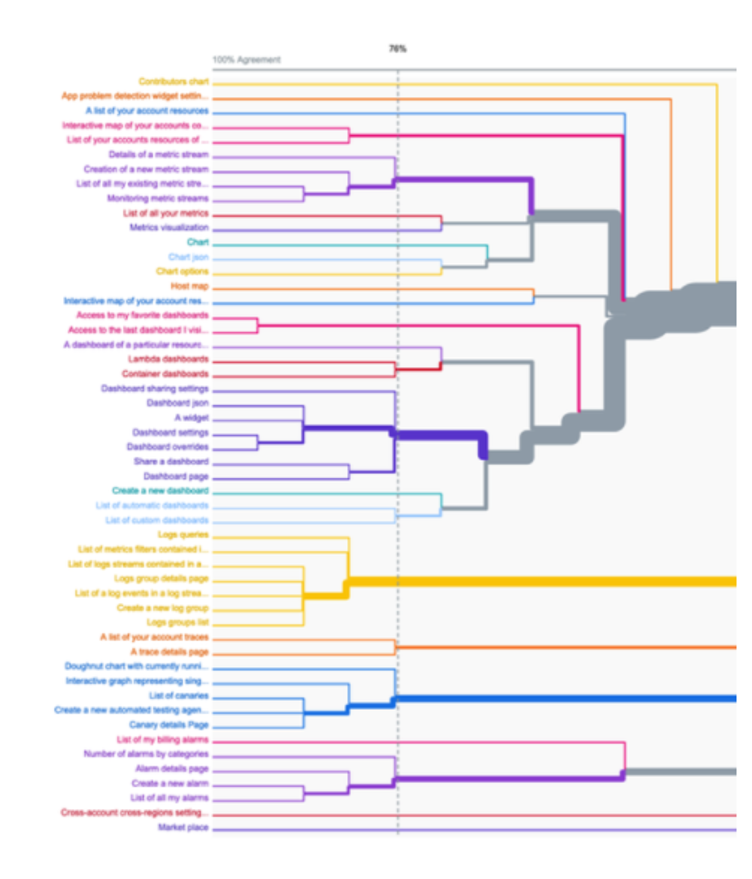
- A dendrogram showing how users grouped items together.
Research #UX navigation survey
What did I do
- An online survey combining 20 open and close-ended questions.
How did I do it?
- Recruiting users from CloudWatch-interest@ mailing list and Slack channel.
What did I get?
- 57 answer recorded vs. 39 fully finished forms.
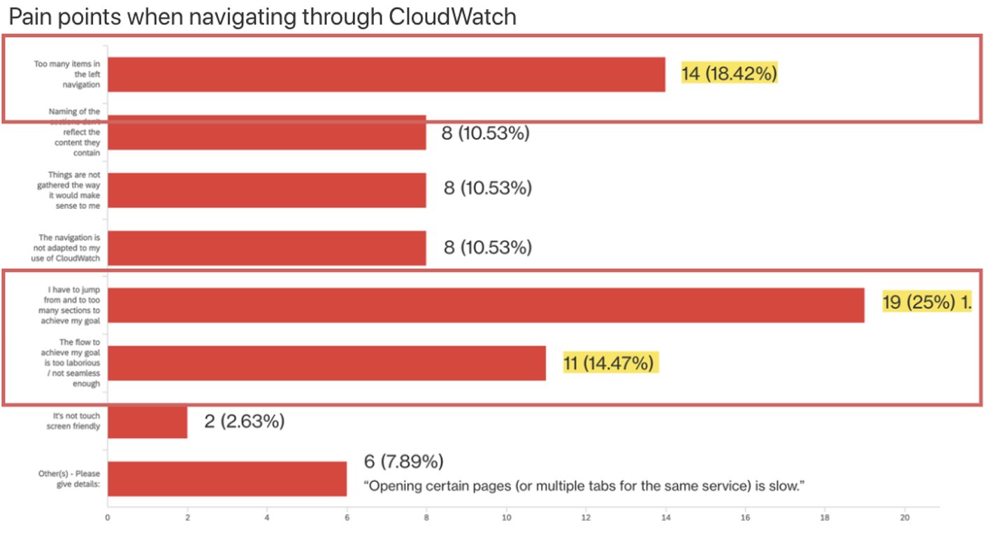
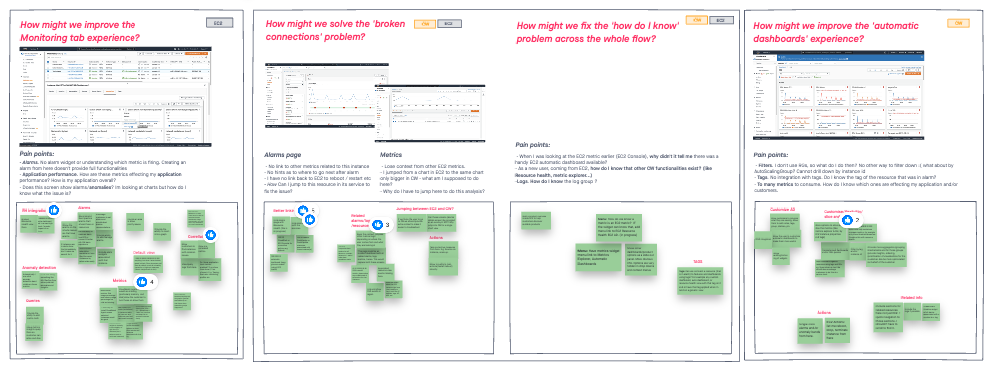
Top pain points
- Users struggle to find their way around AWS and CloudWatch.
- Hard to find information they need
- Hard to discovery functionalities
- Hard to navigate dashboards
- Too many options, too many features, too many items in the main navigation.
No customization and hard to correlate data
- Customer want to see what’s important for them.
- The Home Page doesn’t surface the information the user cares about.
- Customers is not always interested in what CloudWatch offers by default
44% of customers agreed on grouping metrics, metrics streams, dashboards and APM services together under one bucket.
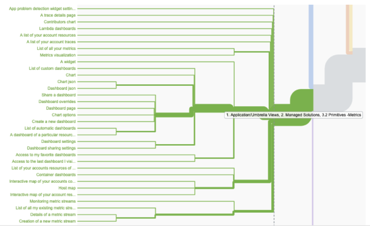
59% of customers agreed on grouping metric streams together with other metrics items.
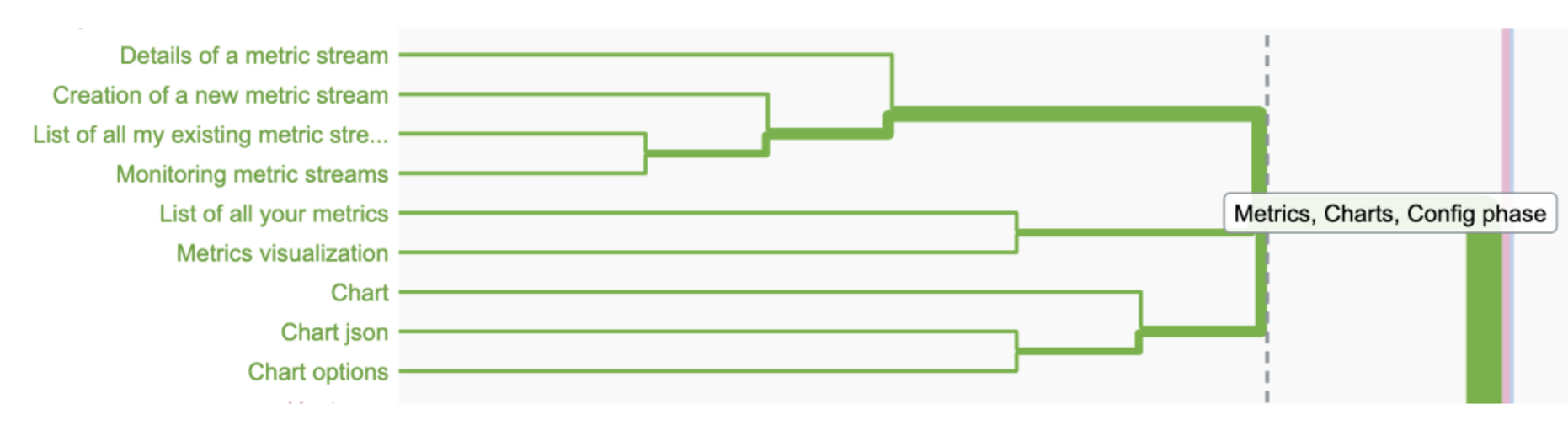
59% of customers agreed on grouping dashboards together.

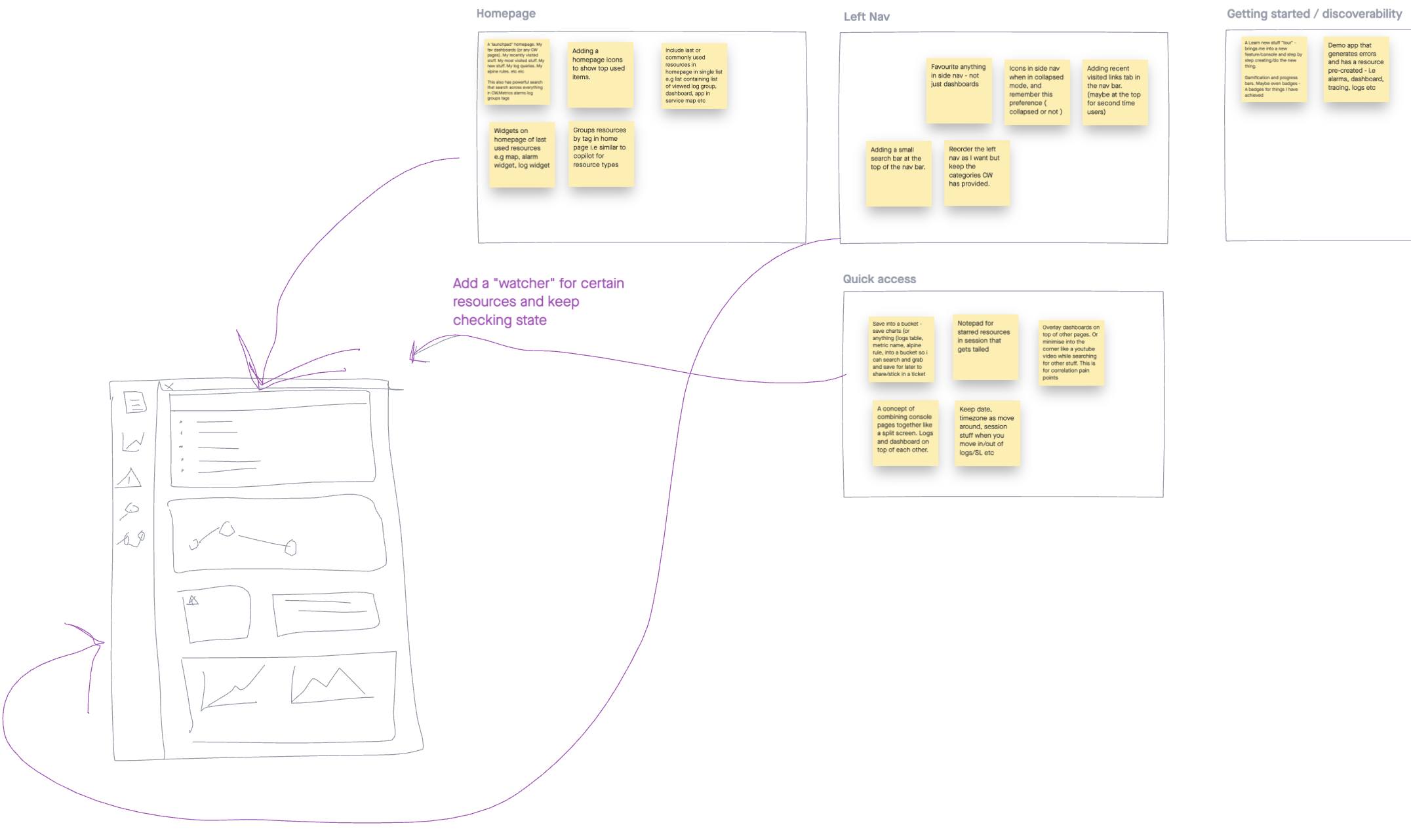
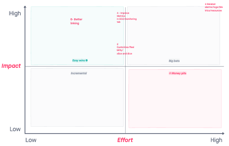
Ideation
- Improve AI of the left navigation, make the left nav customizable, make the customers prioritize menu items based on their use cases
- Make left navigation searchable
- Group items better, add iconography to make menu items more intuitive
- Organize items differently – customers wants to see items in the left nav organized per application
- Improve quick access, allow customers to easily add any page to favourites
Ideation – concept design.
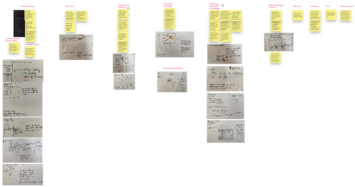
Ideas prioritization
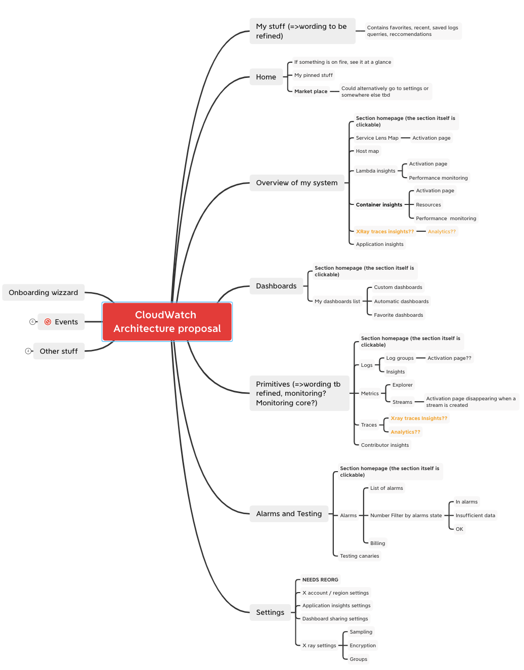
New IA proposal
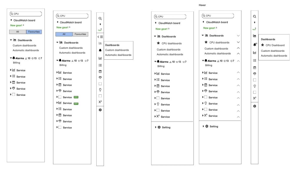
Wireframes
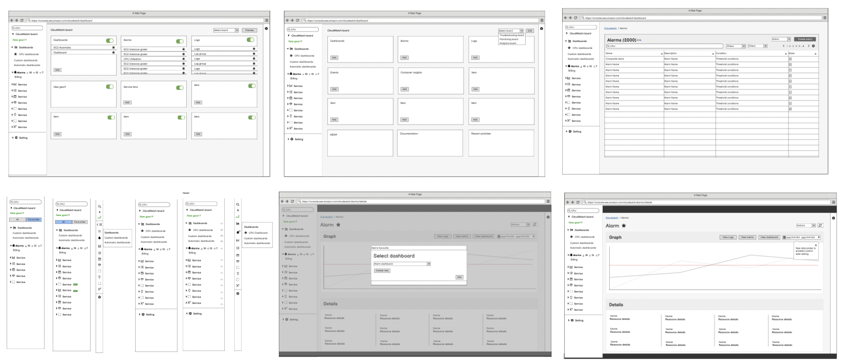
High Fidelity prototype
New IA of the left navigation and new favourite and recents item in the menu.
We tracked behavioural and sentimental metrics
- Adoption: Traffic to the new favourites up by +20%
- Adoption: Traffic to dashboards up by +15%
- Retention: Quality of comments (positive sentiment) up by +10%
- Retention: NPS score – Promoters score up by +5%